4 Expert Tips for Choosing the Perfect Watercolor Paper

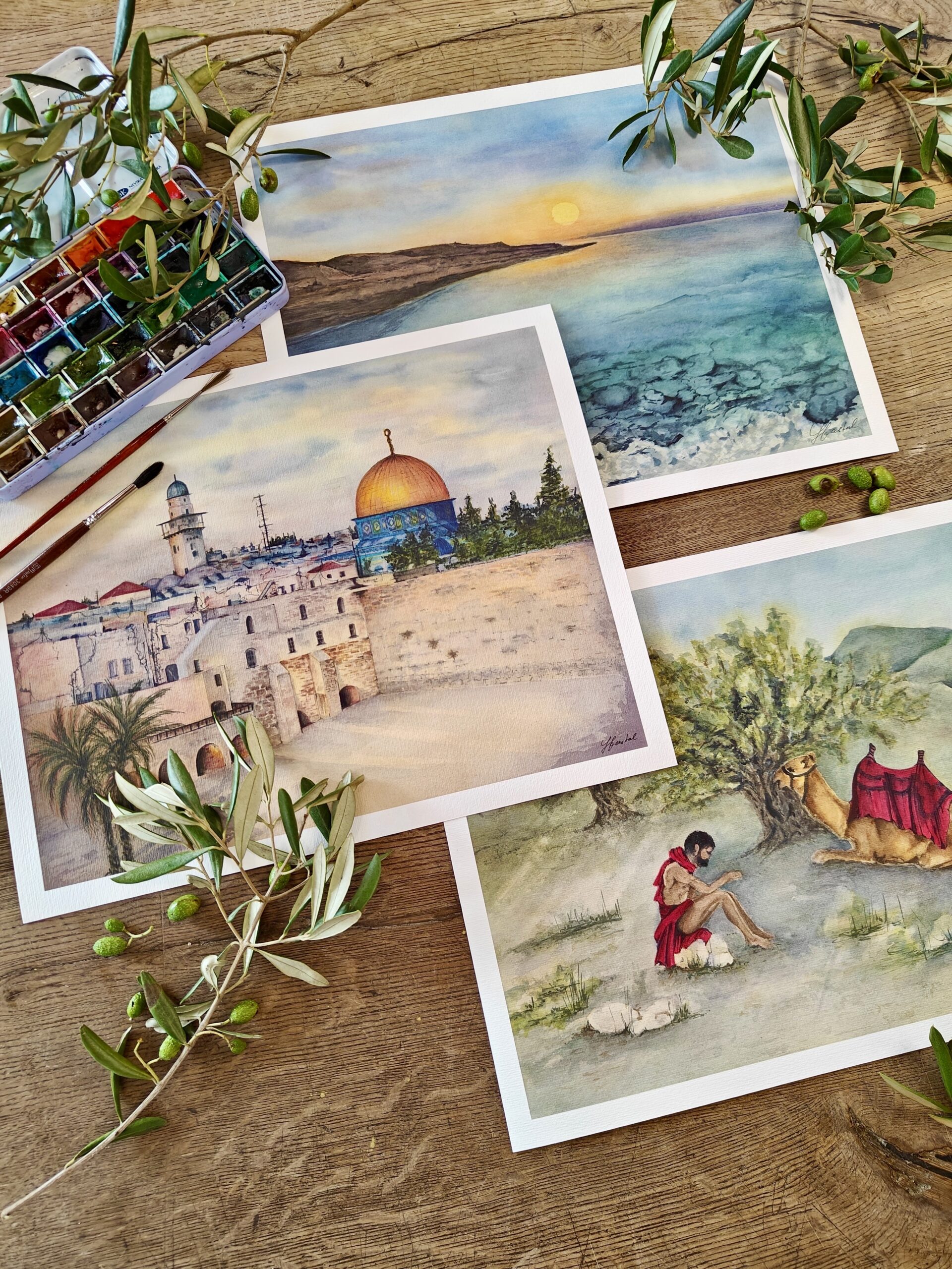
Today, we’ll be taking a look at watercolor papers. The right paper is essential for every artist, and even more so for a painter working with watercolor. I deliberately write “the right paper” and not the best, because it’s only when you pick up a brush and paint that you’ll see how well you get along. There are many types of papers for watercolors on the market, both 100% cotton, cellulose, or a mix of both. Cotton paper is generally considered to be of higher quality and more durable than cellulose paper, but what is suitable for you and what suits you, you have to decide in the end anyway, it is always your preference and often it is trial and error.

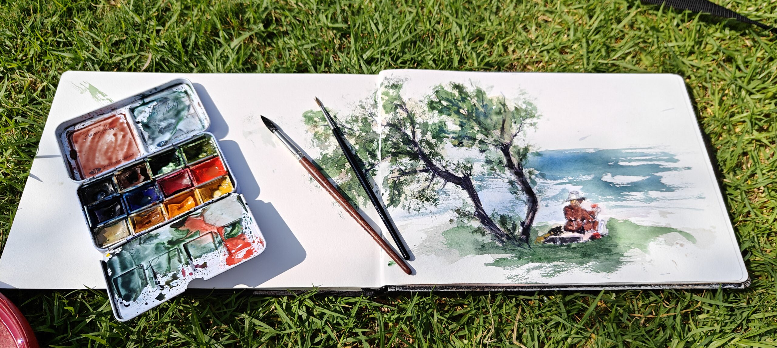
“When choosing watercolor paper, we engage all our senses, just like when choosing a guy. No need to sniff it right away, but otherwise it’s basically the same. We first look at what it is made of, how thin or thick it is, what color it is and what is on the surface. We’ll find out the rest once we have it at home and get to know each other a bit”


1. What types of Watercolor Paper are there

Cellulose paper is significantly cheaper, less durable than cotton paper, and is usually suitable for beginners. I personally started on cellulose from CANSON Montval Aquarelle. Although it could be said that it is a lower-level paper, in the picture you can see how beautiful, fine details and drawings in the fur of a labrador can be created on it. I have tried to achieve the same effect on cotton paper about a thousand times and I can’t do it and apparently only cellulose allows it. If anyone succeeds, please write to me what paper you used.

Cotton paper is ideal for anyone who wants their work to be durable, manufacturers commonly state 100 years, we’ll see. Cotton paper is said to be strong and flexible, which I confirm, and ensures that it does not warp or ripple, even when exposed to large amounts of water, which I don’t quite agree with. If I work with a size say A5 – B5 it’s OK, the paper doesn’t ripple and if it does, once it dries it’s back to its original shape. With larger formats, some warping always occurs, and I don’t feel too comfortable with it, so I prefer to stretch the paper on a so-called blind frame. The smallest size of blind frame I use is 30×30 cm, I don’t deal with smaller ones anymore.

You can learn more about stretching paper so that it doesn’t warp after it gets wet – see my next post.

Cellulose-cotton mix is available on the market in various proportions. But it is very pleasant and after stretching it on a blind frame, working with it is predictable. Based on experience, I would recommend it to beginners, as it brings the benefits of both materials, and also the possible transition to 100% cotton, when suddenly everything is different and the watercolor does not do what we have learned so far, is not such a “dramatic burden for us weaker individuals”.

2. What is the best surface finish for watercolor paper?

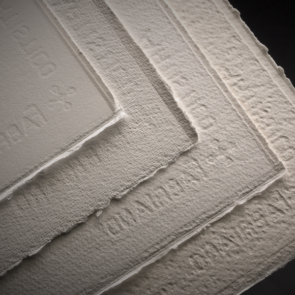
Generally, the surface of the paper is stated in the names.

We have Hot Press which is a completely smooth paper and is suitable for fine illustrations that will then be scanned, and therefore it is not desirable to see the structure of the paper, on glass shows a glass vase, it is also suitable for portraits, where the “pores” in the skin that would be created on rough paper would not flatter anyone.

Cold Press has a slightly rougher, but still finely textured structure, it is a neutral choice and a safe bet.

The third category is Rough, which is a very rough paper with a bumpy structure and, in my opinion, the best for landscapes landscape from my imagination, when you use a large amount of water and go into it with controlled wildness and a slightly abstract idea of the result coming from our imagination.


3. What is the best weight of watercolor paper?

The weight of the paper fundamentally affects its ability to absorb water, and for a good result, it is necessary to master various techniques of watercolor painting, however, if we have been painting for some time, it is sometimes fun to just experiment.

If we have the paper well prepared in advance, for example stretched on a blind frame, I don’t see the weight as something that should scare us, BUT it is necessary to try it.

There are several types of paper on the market, so everyone can choose. For example, a mixed paper containing 25% cotton in a weight of 300g/m or 50% cotton in a weight of 130 g, 160 g, 210 g, 300 g and 350 g. The same applies to 100% cotton paper, which can be commonly bought in weights of 200 g, 315 g and 600 g.

“Paper in the weight of 300 g/m2 is widespread, ideal and I also use it the most.”

600 g/m2 is quite a beast, although it does not need to be stretched on a blind frame, it can be more difficult to work with, especially in a large format when you turn it back and forth. Another thing is the transport of this piece from you to the client. The format 56×76 cm, which you properly pack flat, ensure reinforcement so that the carrier does not break it during transshipment, will grow to a size of min 70×90 cm and more. Something is already paid for such a flat, even if it is not heavy, especially if you send it abroad. Papers of lower weight can be rolled up and their transport is then easier and cheaper.

CAUTION!!! a rolled-up image must be placed on a larger board after unpacking and allowed to return to a straight state on its own. Any smoothing and forceful straightening can break the structure of the paper, and this break will forever be inscribed in your work like a wrinkle on the forehead”


4. What color should watercolor paper be?

Although I list the color as last one, it is essential for me. The color of watercolor paper is not only another attribute when choosing, but it is crucial for the result of our efforts. Since I was writing about choosing a guy, although I like swarthy-olive guys the most, I have to have watercolor paper white, white, white. And here we have a problem. There are men all over the planet, but white paper seems to be my unfulfilled dream. For example, the company Fabriano under the name of the Artistico series produces 100% cotton papers with the name “bright white”. However, if you place “bright white” from Fabriano next to ordinary white office paper, you will find that it has a delicate cream color. Still perfect option from my perspective.

Anymore, I don’t buy papers marked as natural white. I wouldn’t even call them white, but rather slightly beige, maybe. Unfortunately, I feel that this color dampens the colors of light and transparent watercolor. With dark, saturated colors, the problem is not so pronounced, and if you are painting a sandstorm or need to get a mysterious atmosphere into the picture, it can be an advantage.

I don’t know why watercolor papers in bright white color quality do not appear on the market, but I assume that it has something to do with their production, when the cotton would have to be aggressively bleached, and this would affect the archival quality of professional watercolor papers. I have to say that I have not noticed this problem with cellulose. Maybe one day I’ll get around to exploring the technology of making watercolor papers.


What is your experience?

Thanks for reading and I hope this little excursion on papers has helped you make better choices when choosing.

If you have any questions, don’t hesitate to write to me.

Subscribe to my mailing list

About Me

Recommended Posts

PIC 1 _ ARTISTICO HP-CP-SP-Rough
7 Steps How to Professionally Prepa...
IMG20240805144702_Original_Original
4 Expert Tips for Choosing the Perf...

Instagram

Featured Post

PIC 1 _ ARTISTICO HP-CP-SP-Rough
7 Steps How to Professionally Prepa...
IMG20240805144702_Original_Original
4 Expert Tips for Choosing the Perf...